On screen gamepads are wrong but can be made easy !
Update: This article was written in March 2024. For more on mobile interface challenges, see my later post on mobile UI.
Introduction
In today’s digital era, platform games on mobile devices have become a prevalent form of entertainment. Yet, an intuitive user interface is crucial for a fulfilling gaming experience. A particularly problematic aspect is the use of on-screen keyboards, whose lack of precision can frustrate players. This article delves into the challenges presented by on-screen keyboards and suggests ways to reimagine them for better functionality.
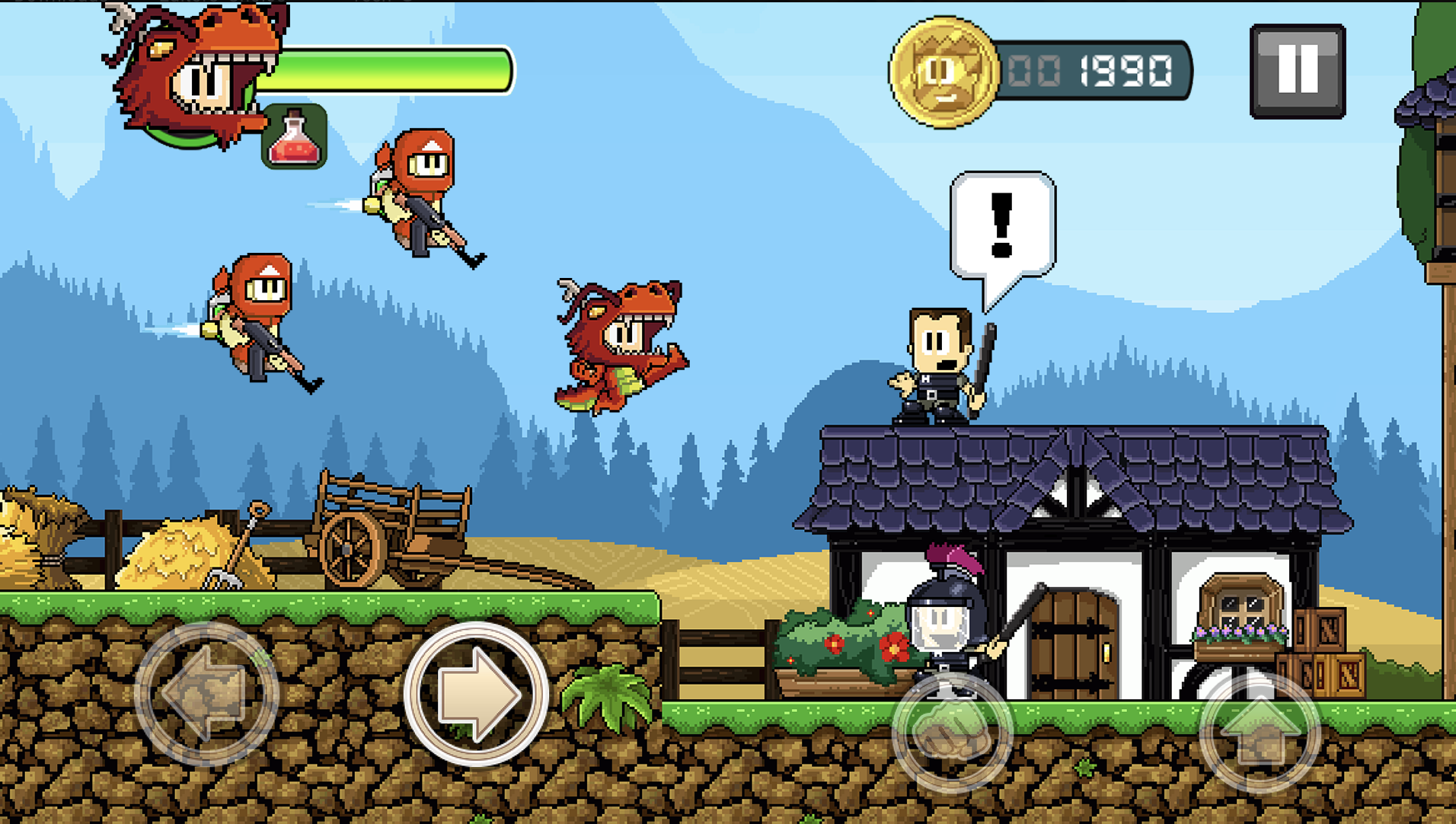
Figure 1: Dan the man (Source: https://play.google.com/store/apps/details?id=com.halfbrick.dantheman&hl=en&gl=US)
The Problem with On-Screen Controls
The design of on-screen keyboards often detracts from the gaming experience. The issue of “button hugging,” where accidental presses disrupt gameplay, exemplifies this. Games and emulators that rely heavily on precise control inputs suffer significantly, making the gameplay feel clunky and unresponsive.
Potential Solutions
There are several ways this could be solved:
- Customizable Controls: Allowing players to adjust the size, location, and sensitivity of controls could cater to a wide range of preferences and hand sizes. This has the advantage to help the user adapt the position, but still do not solve the “button hugging,” issue entirely.
- Adaptive Layouts: Dynamic control schemes that adjust based on the game’s current needs or the user’s past behavior could provide a more intuitive experience. This is even better, but the problem is that it requires much more development as the input is changed during the game.
- Haptic Feedback: Incorporating tactile feedback to confirm button presses could help mimic the physicality of traditional gaming controllers. This is a promising solution but so far, no game has implemented this successfully.
The Screen Grid Solution
However, the best know solution to this issue is to simplify controls and segmenting the screen into larger, more manageable sections. For instance, Dadish divides the screen into three areas, simplifying the search for the correct buttons. This maximizes the button size as all the screen area is used.
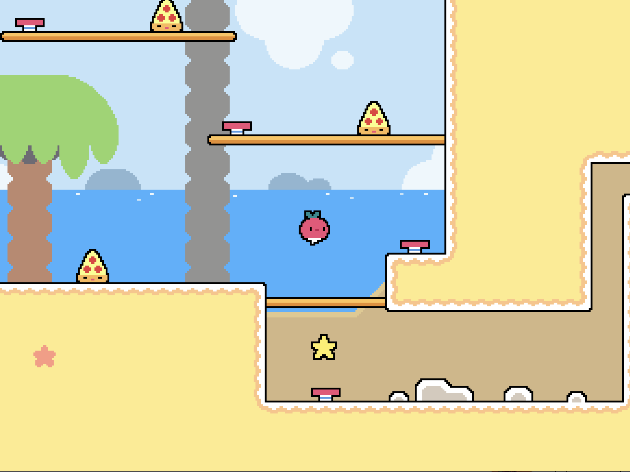
Figure 2: Dadish heavily uses user interaction and yet no on-screen keyboard is shown (Source: https://play.google.com/store/apps/details?id=com.thomasyoung.gooddadish&hl=en&gl=US)
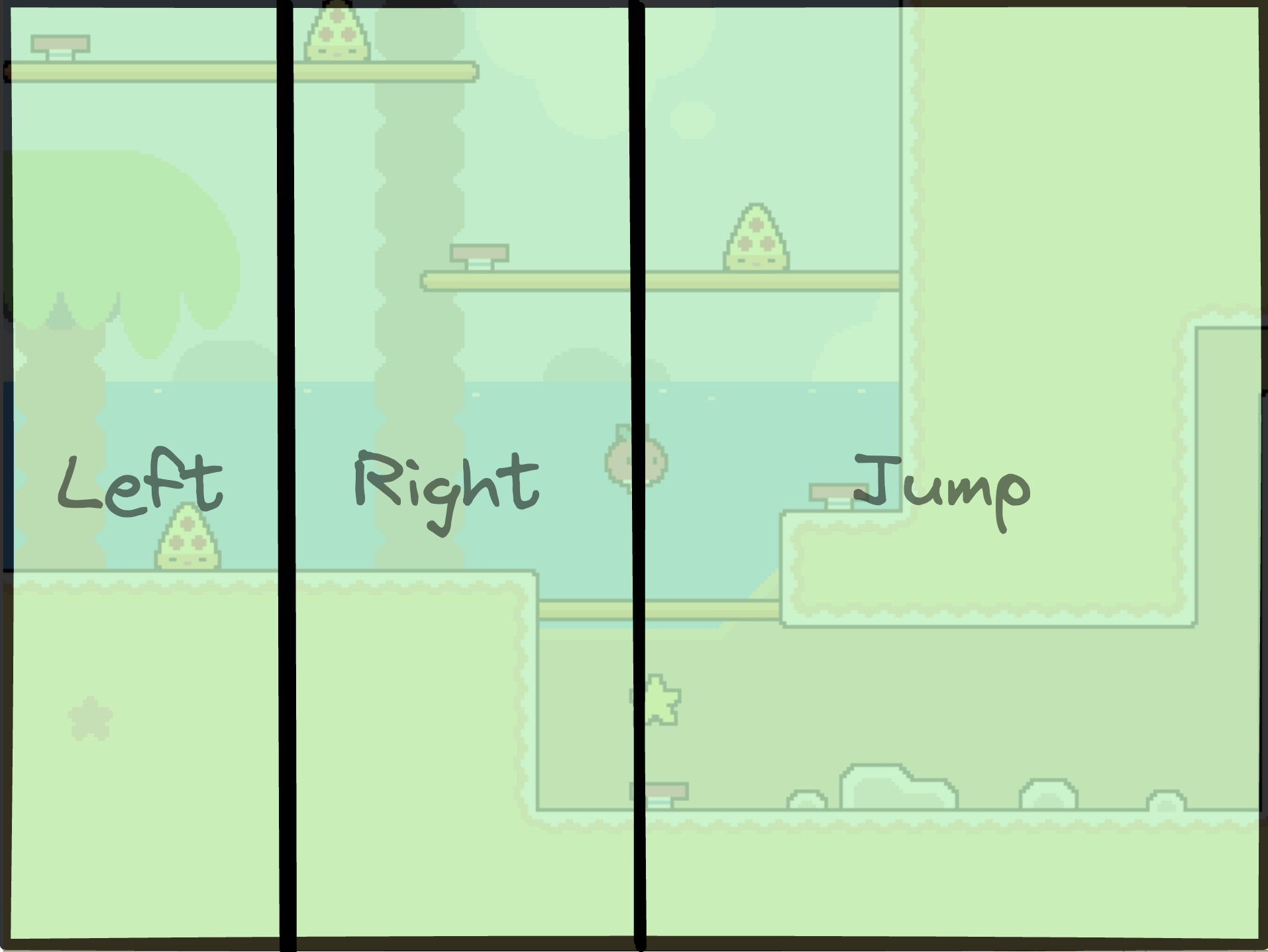
Figure 3: Dadish’ division of the screen for input (Source: https://play.google.com/store/apps/details?id=com.thomasyoung.gooddadish&hl=en&gl=US)
With this in mind, we can even think that the screen could be divided into 12 and that would provide a grid for game buttons. Then this grid could be adapted for games. For example, we can reimagine the Zombotron interface with this grid idea. As we can see, the button area is maximized.
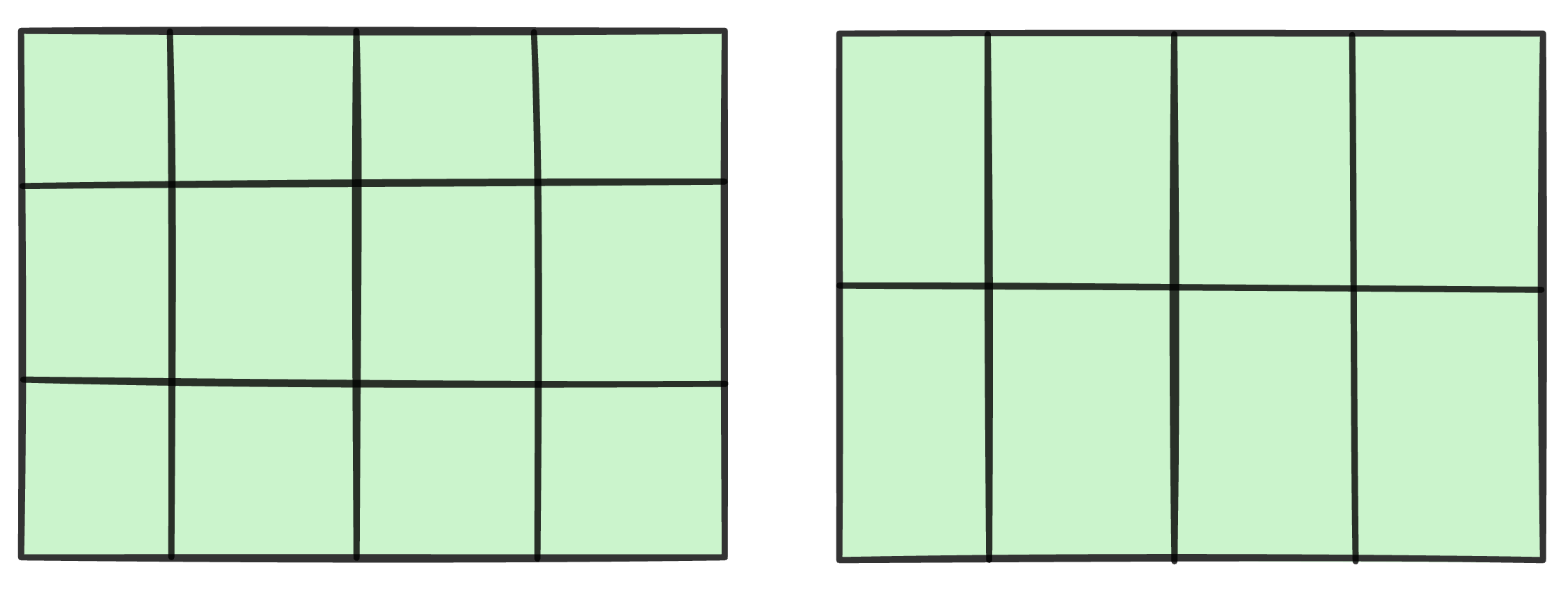
Figure 4: On screen input grid
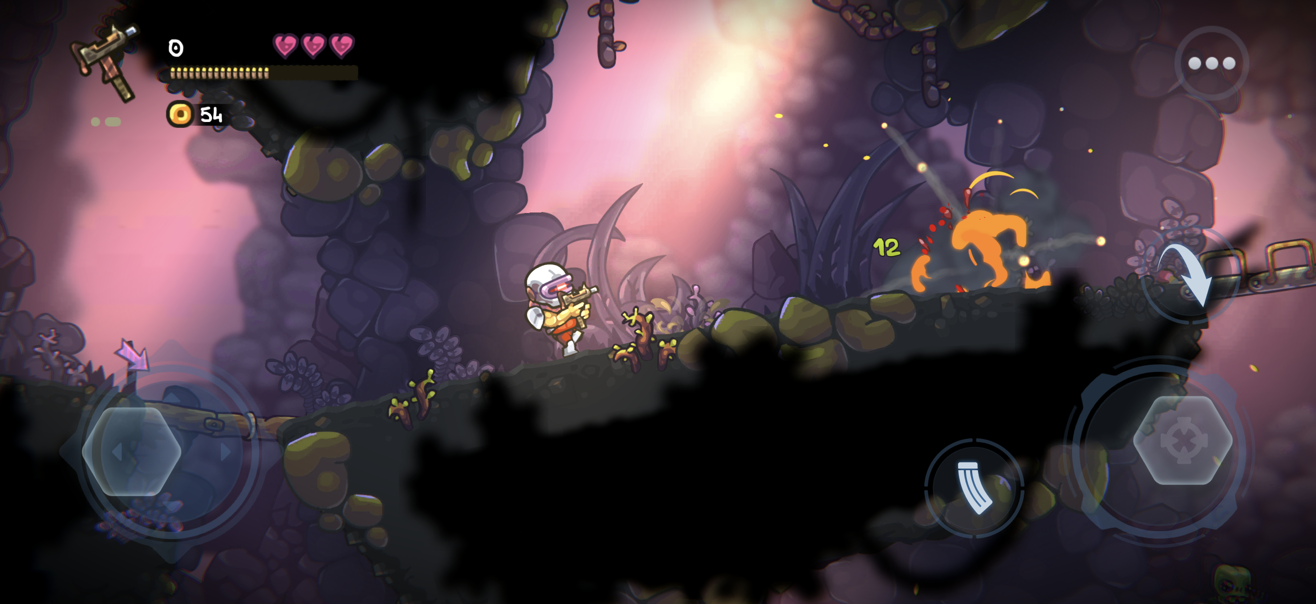
Figure 5: Zombotron left buttons are missed due to their smaller size
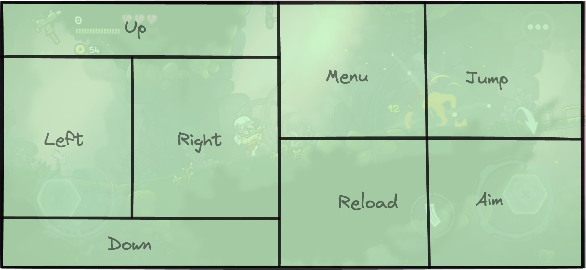
Figure 6: Reimagined interface using the grid interface
Conclusion
In conclusion, as mobile gaming continues to evolve, so too must the tools we use to interact with these digital worlds. By addressing the on-screen keyboard challenge, developers can unlock the full potential of mobile gaming, creating more engaging, enjoyable, and accessible experiences for all.